In this post, we use some fairly new technology of time series analysis namely neural nets and interactive charting tools. These techniques are the state of the art. The dataset we use for this example has: missing data, outliers, poor formatting. The dataset i about restaurant at a campsite that is open whole year. There is a peak season in summer, and so we aspect to have seasonal data and trend might be present. The data are the revenue by month in USD, that range from January 1997 to December 2016.
We start CLEANING THE DATA. Fairly often this is the pat that takes the most time. We start removing the quotes, convert the data in time series format, detecting and replacing missing data and outliers.
library(knitr)
library(kableExtra)
library(formattable)
revenue <- read.csv("C:/07 - R Website/dataset/TS/camping-revenue-97-17.csv", sep = "," , quote = "")
colnames(revenue)[1] <- "V1"
colnames(revenue)[2] <- "V2"

# Clean data
library(tidyr)
revenue <- separate(revenue, col = V2,
                    sep = c(2, -3),
                    into = c("resr", "data", "rest2"))


# Convert to time series
myts <- ts(as.numeric(revenue$data),
           start = 1997, frequency = 12)

summary(myts) #check it
Min. 1st Qu. Median Mean 3rd Qu. Max. NA's
3 19019 23260 36997 26879 3334333 4 As we can see from the result above we have 4 missing values. Furthermore, it is quite important to realise that we have a monthy revenue which is around 10000 (1st Quartile) to 30000 USD (3rd Quartile). But interestingly, there is a minimum of 3 USD and a maximum of over 3 million UDS. This makes no sense at all, and this says to us we are in presence of outliers. How do we tackle the outliers problem? We have to detacts thse observations and replaces them with a linear interpolation.
library(forecast)
myts <- tsclean(myts)

summary(myts) #check it
Min. 1st Qu. Median Mean 3rd Qu. Max.
14209 19298 23273 23309 26689 34366 plot(myts)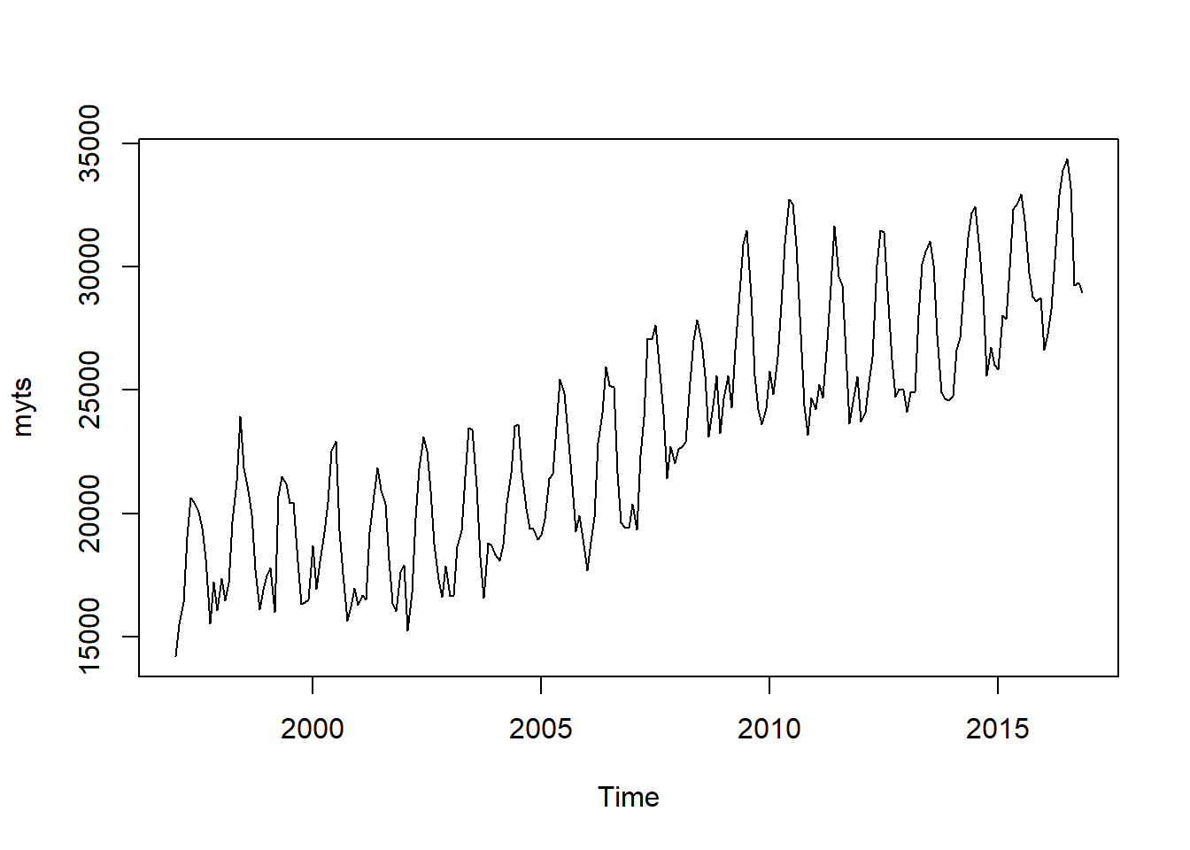 Looking from the summary here above, we see that now the range of revenue is from 14209 to 34366, and we have not missing values. The graph also confirm that the all the values now are plausible and the data are clearly seasonal, and there is also an upper-trend. The model has to be able to catch all of these patterns.
NEURAL NETWORKS Neural Networks are the new in tme seires analysis. In most of the cases NN has hidden layer which is an intermediary layer between the input and the output, and is called Feedforward Network. For NN in time series analysis is called Neural Network Autoregressive Model, NNAR. Like for the ARIMA model there is a specific notation :
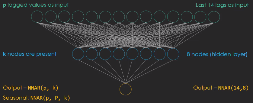
The p values are used as inputs, k nodes are present in the hidden layer. Looking at the figure above, tha means we have 24 lags as input combines to 8 nodes in the hidden layer. When the data are seasonal the NNAR model is more complicated and we have to introduce the P parameter that denotes the seasonal lag. Usually P is equal to one, which means that the preavious observation from the last season is also included in the model.
# Set up a NN
mynnetar <- nnetar(myts)
# Forecast 3 years
nnetforecast <- forecast(mynnetar, h = 36, PI = TRUE) # PI create the prediction intervals for the forecast
library(ggplot2)
autoplot(nnetforecast)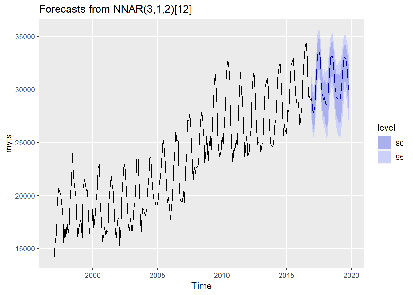 The model recognizes that there is a seasonal pattern (the summer get much revenue than the winter does). Interestingly, the yearly peacks (summer) of the forecast stay at an even level in the three years forecast, but below (winter) are ascending. The parameter order of the Neural Network Autoregressive Model is: NNAR(3,1,2)[12]. This means the NNAR uses the first three observations as the input, plus one observation of the last seasonal cycle. The seasonal cycle is an yearly one [12]. Essentially, there are four input values and these are compressed into two nodes in the hidden layer.
INTERACTIVE GRAPH Thetime series results should be presented interactively in order to highlight certain features.
# data we need for the graph
data <- nnetforecast$x # raw data
lower <- nnetforecast$lower[,2] # confidence intervals lower bound
upper <- nnetforecast$upper[,2] # confidence intervals upper bound
pforecast <- nnetforecast$mean # th element mean

mydata <- cbind(data, lower, upper, pforecast) # put everything in one dataframe

library(dygraphs)
dygraph(mydata, main = "Campsite Restaurant") %>%                                       # get data and the caption
  dyRangeSelector() %>%                                                                 # the zoom tool
  dySeries(name = "data", label = "Revenue Data") %>%                                   # add time series which are store in: data <- nnetforecast$x
  dySeries(c("lower","pforecast","upper"), label = "Revenue Forecast") %>%              # add the forecast and CI
  dyLegend(show = "always", hideOnMouseOut = FALSE) %>%                                 # add the legend (time series + forecast)
  dyAxis("y", label = "Monthly Revenue USD") %>%                                        # label the y axis
  dyHighlight(highlightCircleSize = 5,                                                  # specify what happen when the mouse in hovering the graph
              highlightSeriesOpts = list(strokeWidth = 2)) %>%
  dyOptions(axisLineColor = "navy", gridLineColor = "grey") %>%                         # set axis and fridline colors
  dyAnnotation("2010-8-1", text = "CF", tooltip = "Camp Festival", attachAtBottom = T)  # add annotation
The Interactive graph above consists in two distinct fractions. The longer line at the beginning is the original data. The second part which is 36 months long gets activated as soon as we hover it, and this is the forecasting with prediction intervals. At the bottom we have an interactive range selector where we can specify the level of zoom in and out in the timeline.
For more informatioin about Time Series: Forecasting with Exponential Smooting by Rob Hyndman. Time Series Analysis, Forecasting and Control by Box, Jenkis, Reinsel, Ljung. Forecasting with Dynamic Regression Models by Alan Pankatz. Forecasting: Principles and Practice by Rob Hyndman.